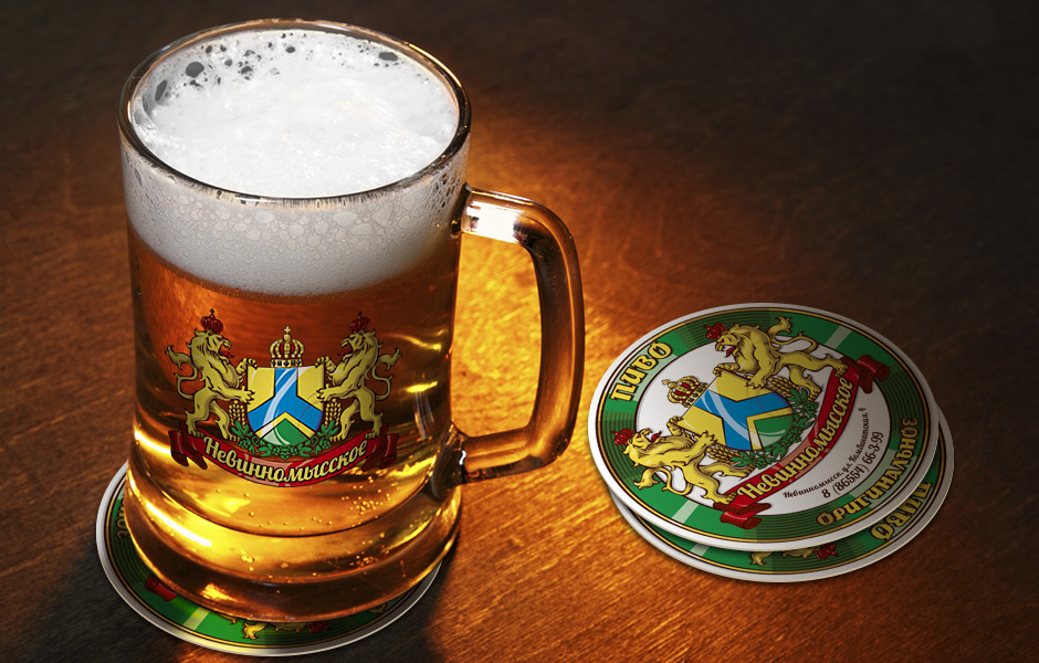
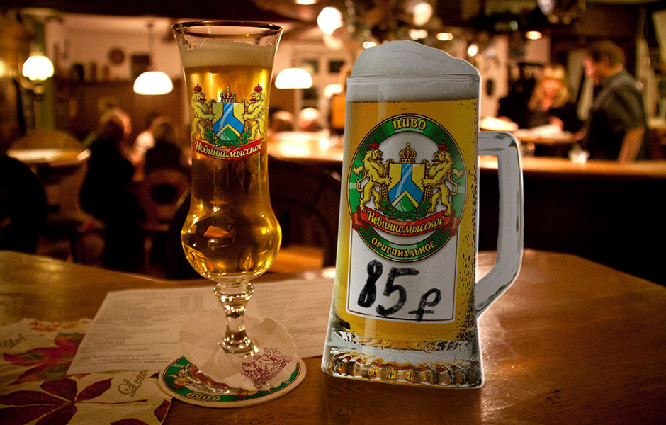
Beer "Nevinnomysskoe" is positioned as exclusively draft, intended for consumption in appropriate cafes, restaurants and bars.
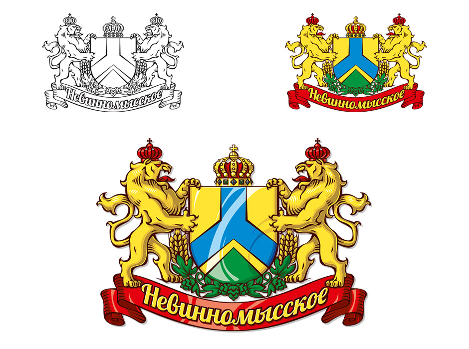
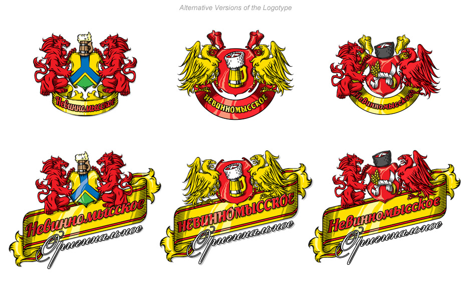
At the request of the customer, the heraldic theme was taken as the basis. The official flag of Nevinnomyssk the Town (unfurled 90 degrees counterclockwise) was defeated on the shield. But the problem is that rather flagrant mistakes were made from the point of view of heraldry on the flag - the blue and green sections are tightly in contact with each other, which can be regarded as overlapping “tincture” on each other, and this is unacceptable. I decided to make a “golden” layer between these areas, which was accepted by the customer with understanding.
For the sake of an effective brand look, I had to make some heraldic assumptions: in particular, crowns were used on the “cross” and on the heads of the “supporters”.